I love using design to translate complex problems, into simple, useable and intuitive experiences
Portfolio
About
I’m Tim, a Melbournian with an eye for detail and a passion for everything design related. I love collaborating with other designers, project managers, developers and stakeholders to create intuitive user experiences that delight!
My main skill sets include: Designing interfaces in Figma, Wireframing and rapid prototyping, creating design systems, and user testing.
When I’m not wireframing, you’ll probably find me sipping coffee ☕️, training for marathons 🏃🏻, walking the doggo 🐶, cooking 🍳, or at the footy 🏟️
Contact Me
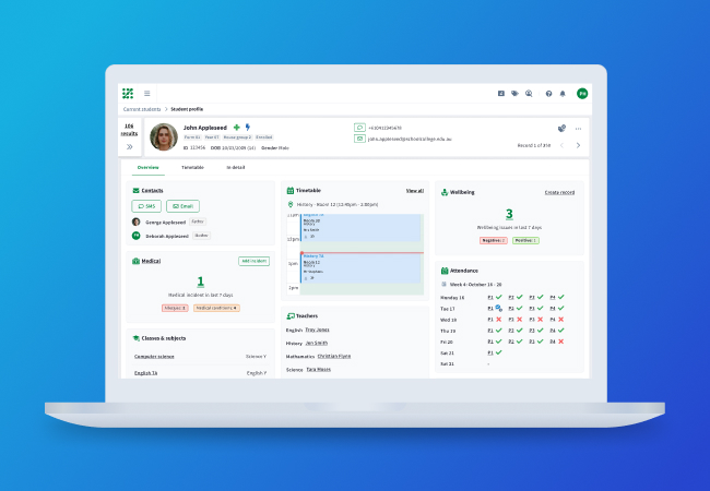
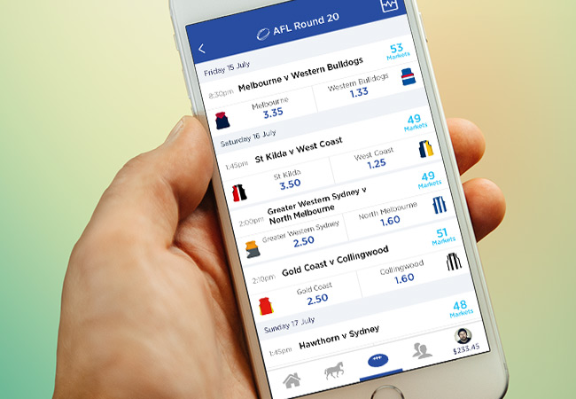
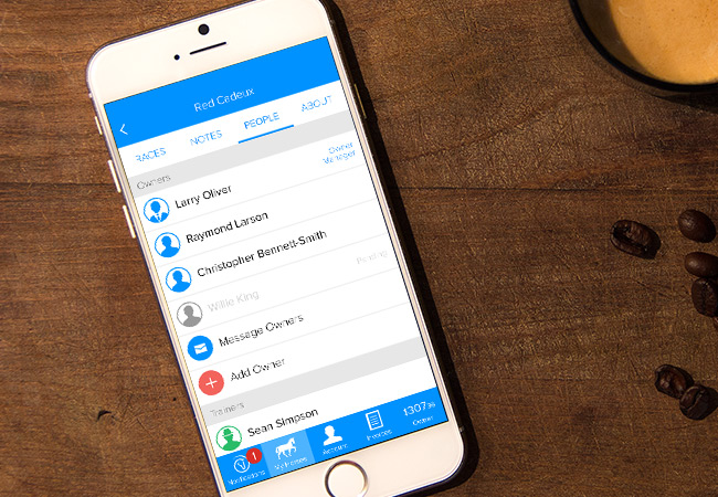
Education Horizons
Education Horizons is Australia’s largest EdTech company, providing software for over 2200 schools and 3 million school users in more than 60 countries across Australia, UK, Europe, Asia, the Middle East, Africa and NZ. I was brought on to help develop EH's new SASS product, the next generation student information system - Zunia.
The main objective was to build an online SASS product up to a point where it provided equal or more value than existing ‘legacy’ products.
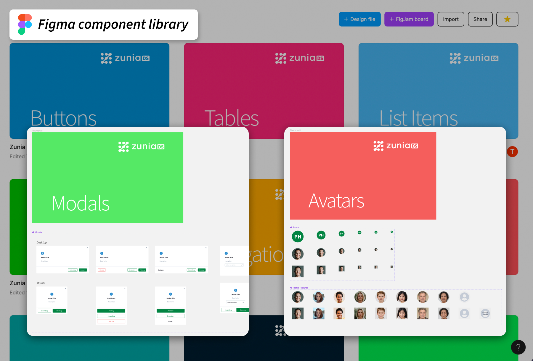
Design system
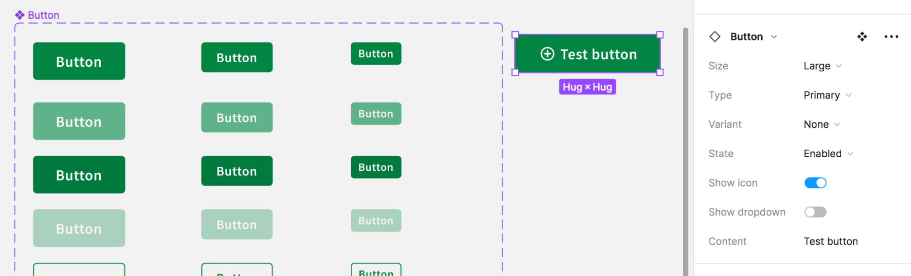
One of the main areas of the design system to build and maintain a Figma design patterns and component library. This is used to keep designs consistent, and enable designers to quickly build designs using existing patterns.
Here is an example of a design component created in Figma that once set up, can be quickly added to any UI by all designers. Variants is a powerful tool in Figma that allows you to apply small changes or different states to the component. In the below example, from the one component we can change: 3 sizes, 4 states, 5 variants, 4 states, and the ability to add and change icon and the text content, which vastly improves our workflow efficiency.
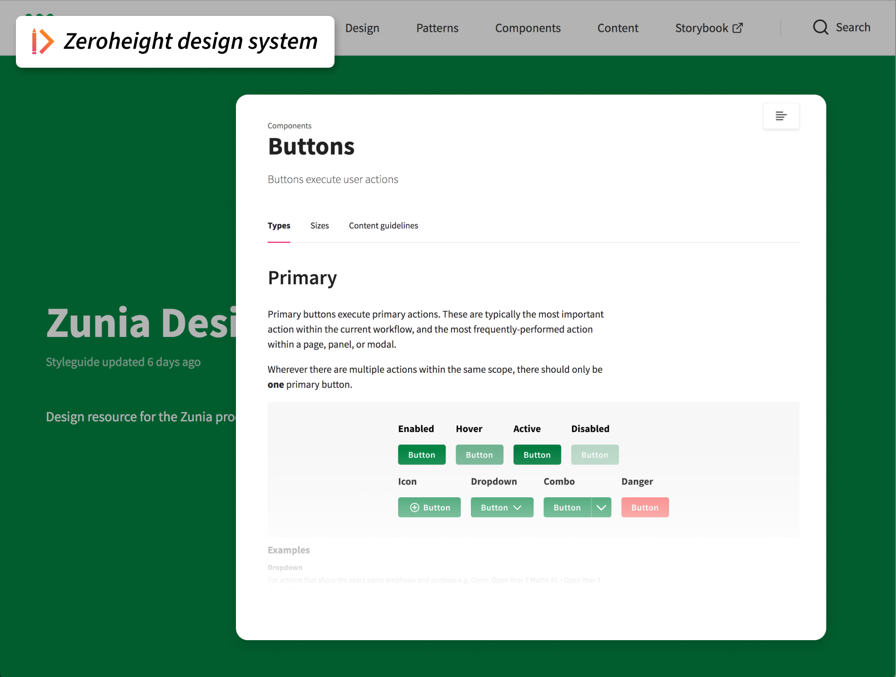
The other important aspect of the design system is the style guide and documentation. This is used to give further context and constraints around how the patterns and components are used, and is useful for the wider team such as developers to better understand the intentions of the designs.
UI / UX design and process
Typically when starting a feature, I'd have a kick off meeting with my PO/PM to discuss and gain an understanding of the goals of the feature, primary users and how they may work, and any questions we need to find answers to. Identify stakeholders and subject matter experts within the business that may be able to assist.
There would usually be a UX review of our existing or legacy products that could provide a good starting point on how a process works. We were lucky enough to have a rock solid (all be it very old) software solution used by many clients to give us a foundational understanding of most of the features we worked on. Along with UX review of our own products we'd also perform a competitor analysis to better understand the type of offerings that our users would expect UX wise, and features wise.
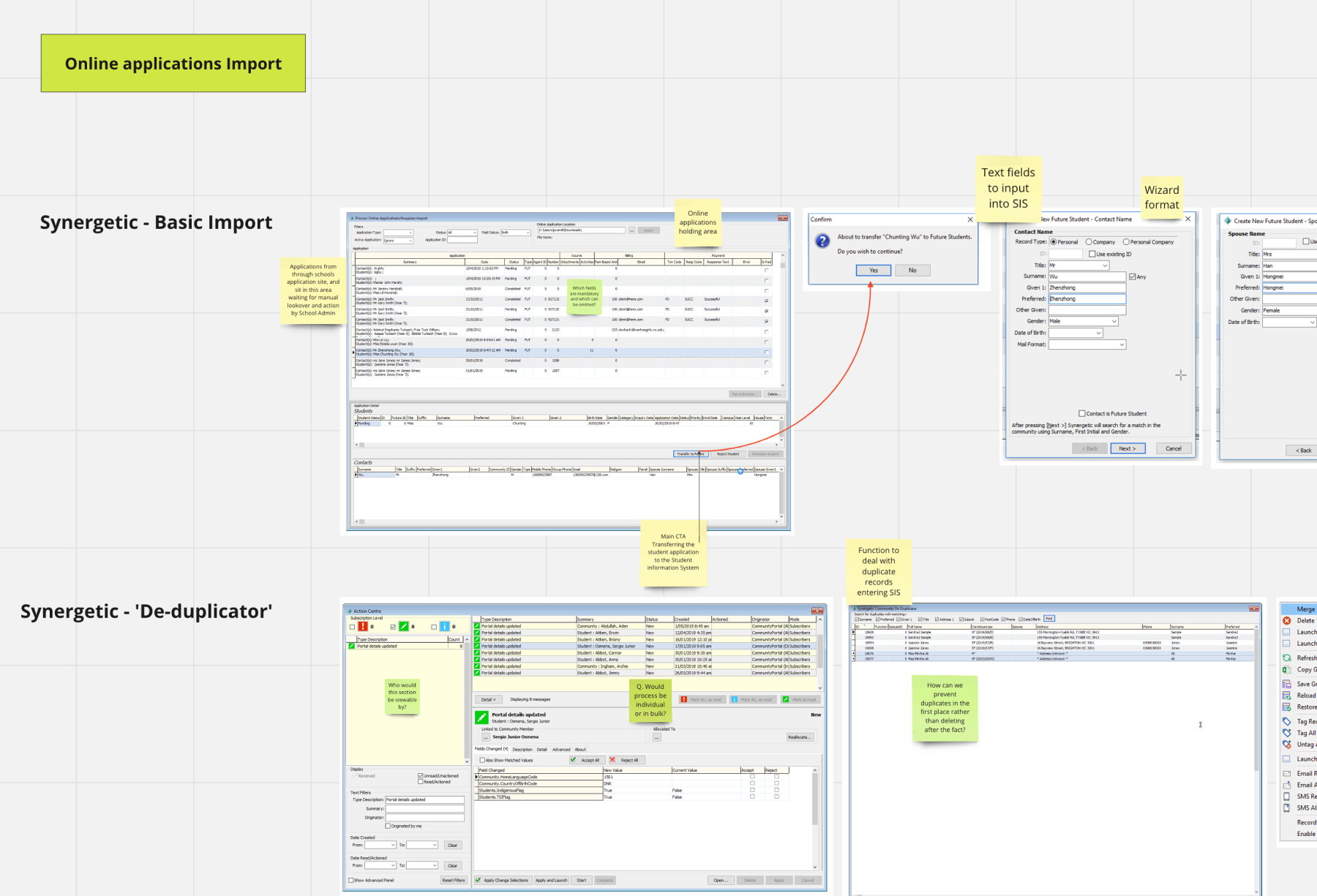
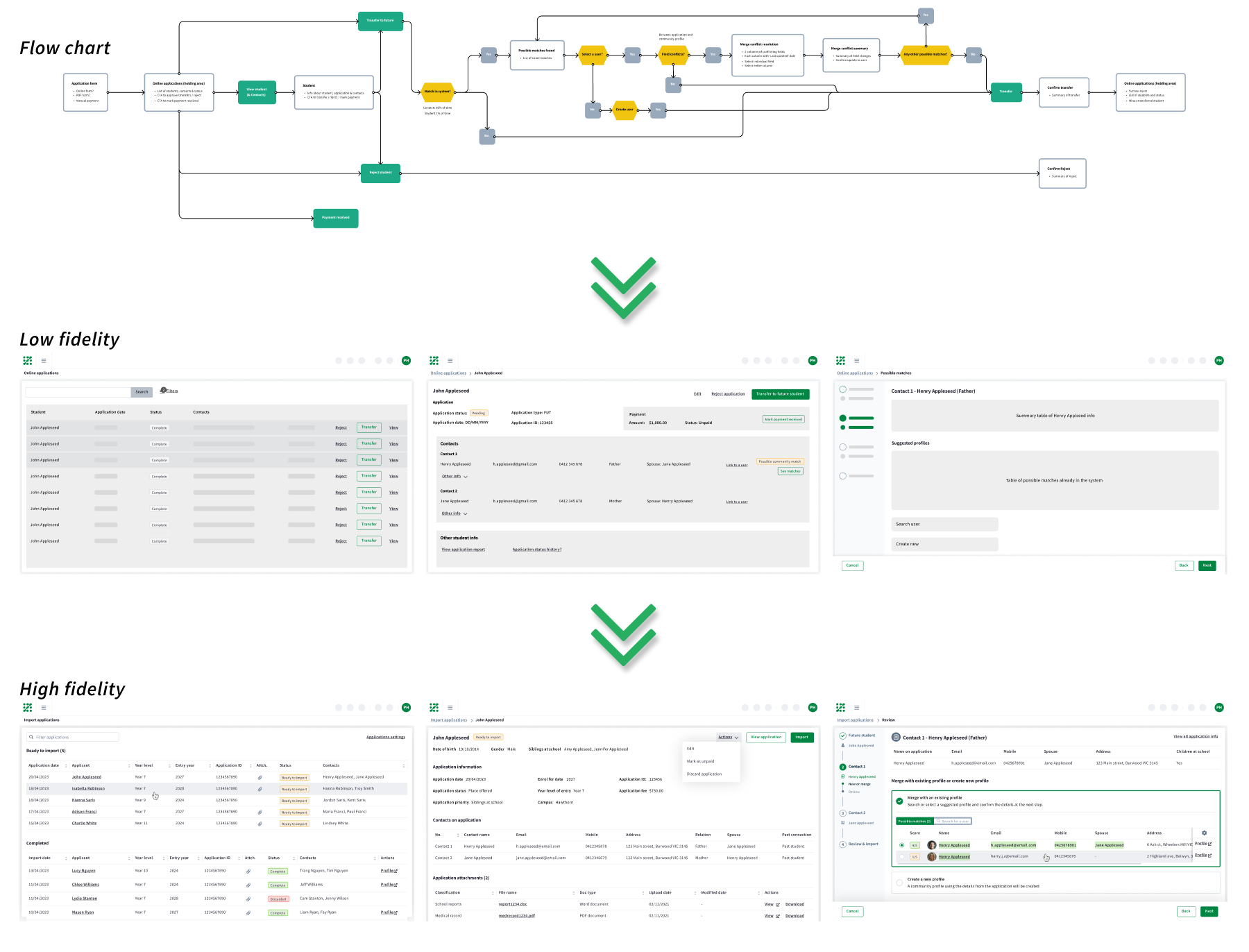
Designing the flow of a task generally starts at a high level with flow charts or journey maps to help envision the process and help check off all the requirements. Then I'll design out a Low fidelity flow to start getting an idea of how the user would step through each screen to complete the task. I'd continually iterate and gradually capture all of the on screen elements like buttons and copy that will be required to navigate through the user flow. From this point we can gather internal feedback (Product team, stakeholders, subject matter experts and dev), or potentially do some user testing to validate our ideas. Eventually the UI mockups will reach the high fidelity stage, where all of the finer details such as UX content and design patterns are completed.
User testing
The knowledge held internally can vary from rich to non-existant depending on the feature and sometimes user testing is critical to help validate assumptions, and give further insight into user behaviours, preferences, andpain points. Speaking to users has at times validated all of our hypotheses, or at other times has provided completely new understandings.
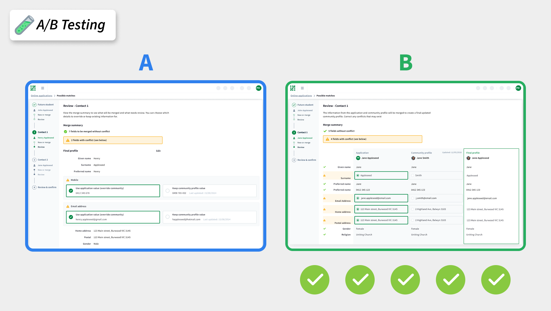
Below is an example of a feature that was taken through 2 rounds of prototype testing, each of which brought further tweaks and changes. One of the rounds we intended to A/B test to find the preferences of a particular critical screen in the flow. We had some assumptions internally that screen B would be preferred, and this was validated by all 5 users.
Client:
Education Horizons
Date:
2020-2023
Service:
UX Design, UI Design
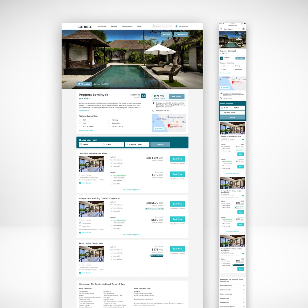
TRAVLR
TRAVLR is a travel start up with a mission to provide end to end travel experiences to their users from travel inspo, all the way through to booking flights and hotels through their existing brand 'The Bali Bible'.
I spent almost 2 years helping to overhaul the existing travel inspo website for desktop and mobile, before moving onto a new booking platform for hotels, flights and travel deals.
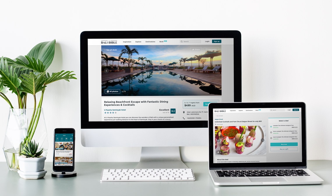
Below are a couple of examples of our responsive design. From our user research we discovered that most of the initial browsing and small deals purchases was via mobile. But the larger purchases were being made via the desktop site, making them both critical to the overall user experience.
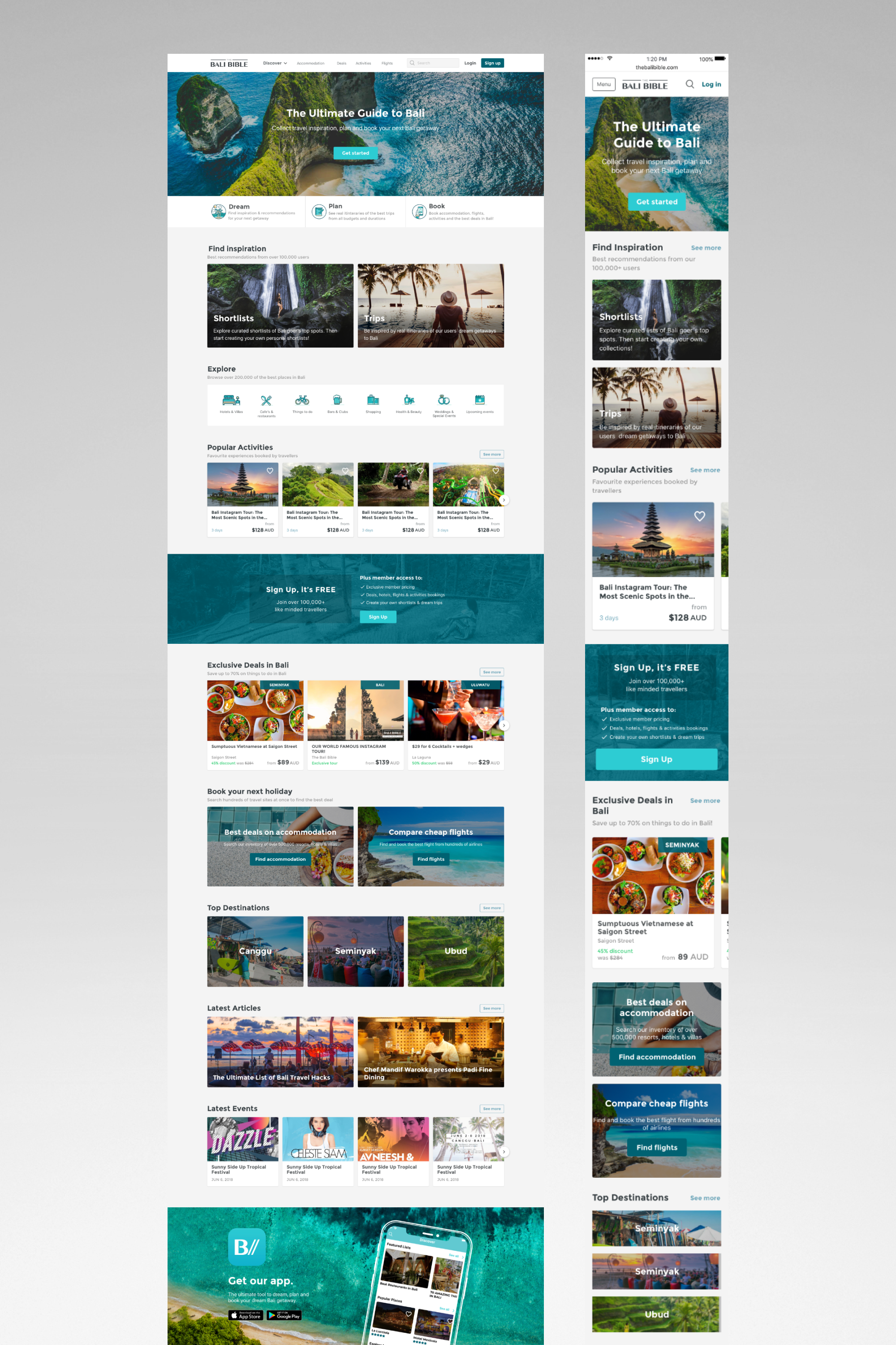
Landing page responsive designs
Final mockups of responsive home page designs. After going through an arduous process of planning, wireframing, testing, and iterating, we eventually landed on these designs as v1.0 for the facelifted home page, with the intention to continuously gather feedback and iterate.
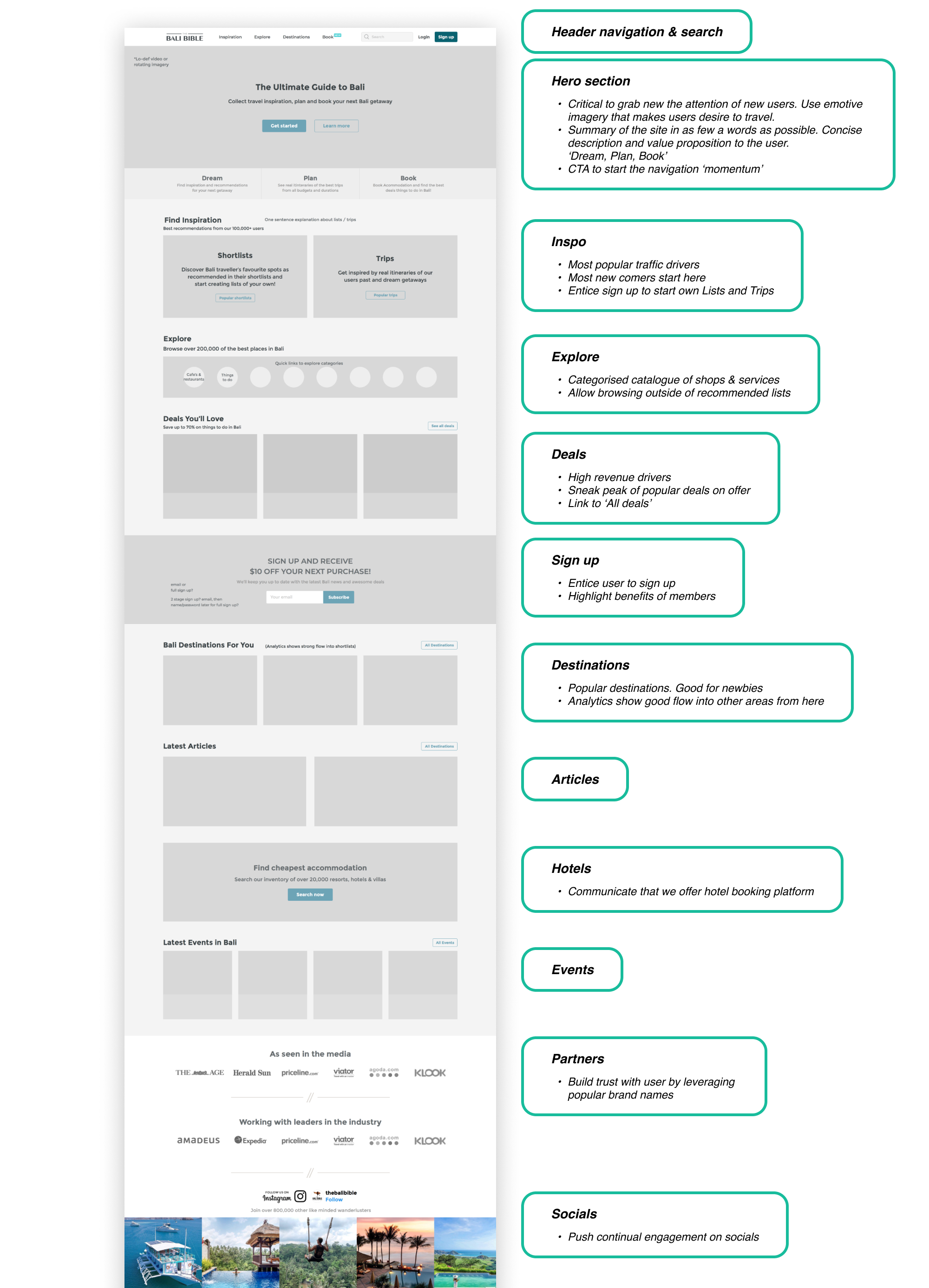
Design process - Wireframing
We identified the home page as one of the key entry points for traffic via Google analytics particularly for new users. It was therefore critical that new users would understand the offerings of The Bali Bible and find it easy to navigate and find what they were looking for. I logically created a heirachy of available information and sectioned it out down the page with the less critical info positioned lower the page as the user scrolls down the homepage.
See below the version we designed for new users. The above process was also performed for 'Logged in users'. as the messaging for new users and members of the site would clearly be different. In short, new users needed to be pitched in clear way, and existing users needed efficient access to common tasks, and personalisation.
Hotel booking responsive designs
Client:
TRAVLR
Date:
2018-2019
Service:
Web/Mobile/App design
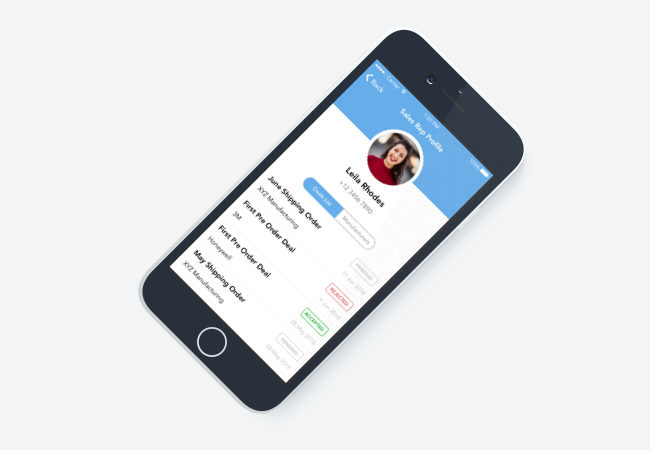
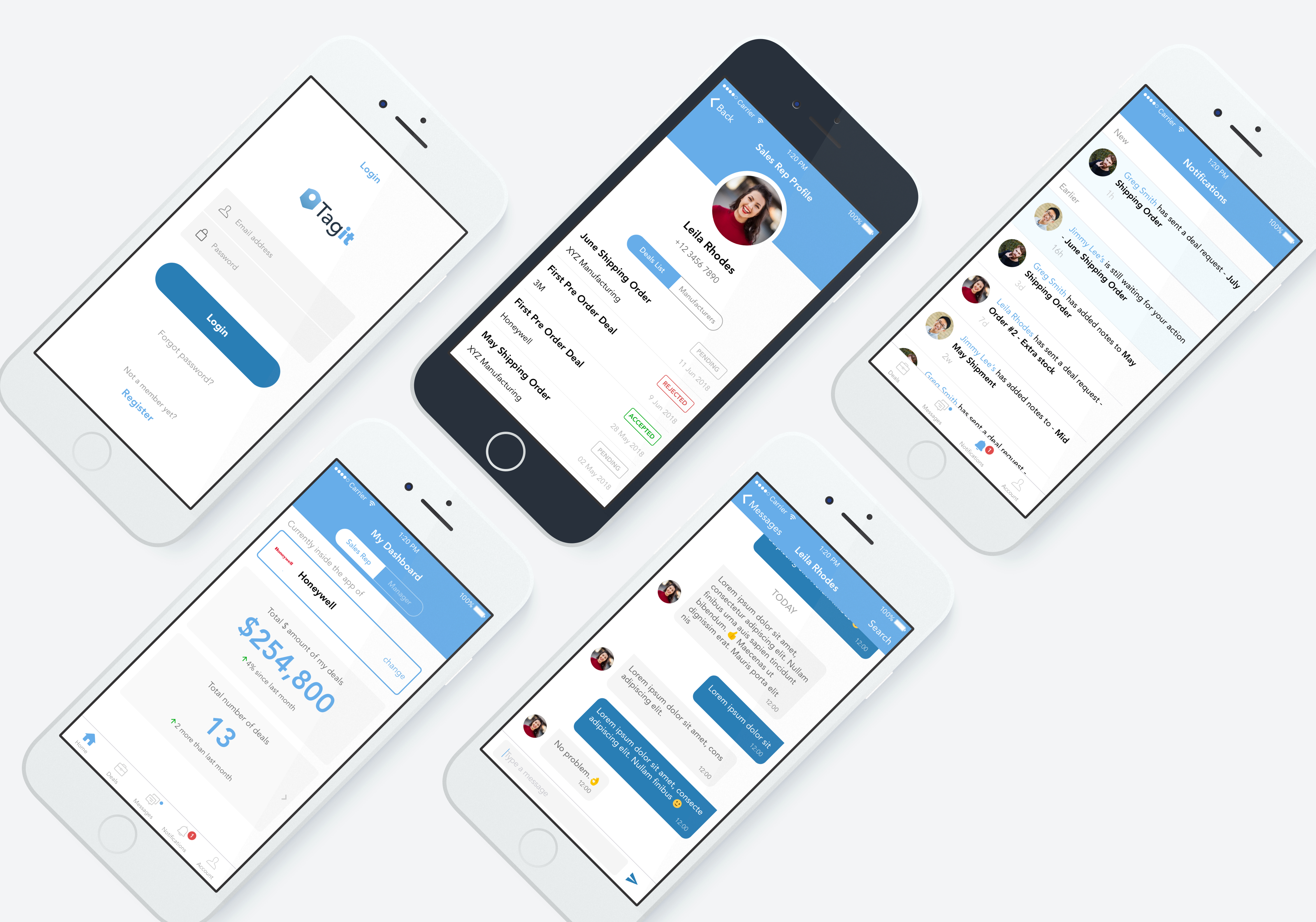
Tagit
Tagit was a prototyped app designed to help the sales representititves create deals, prices and quantities to be approved by manufacturers. Manufacturers can receive the deals request to accept and reject. Sales Representative and Managers can chat with each other for any concerns with the deals once the new deal is created. The prototype was used to to aid a presentation at a conference to pitch to investors
Client:
Tagit
Date:
2018
Service:
App Design, Logo design
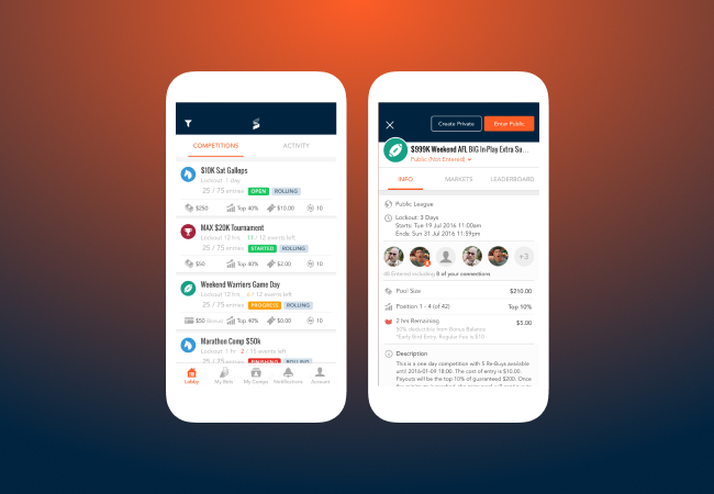
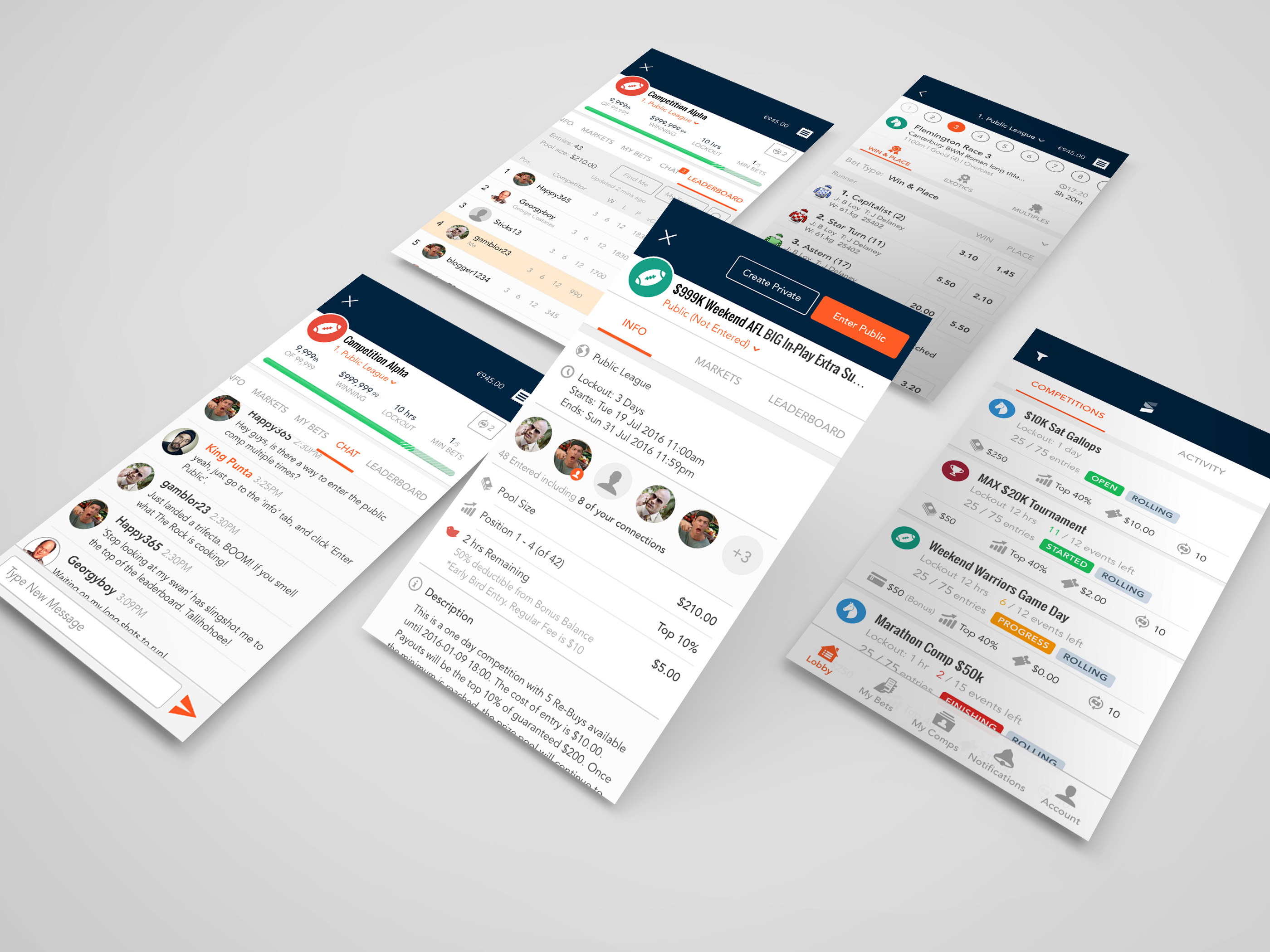
Sportchamps
Sportchamps is a brand new Fantasy Sports Betting start-up which has desktop and native IOS & Android applications. I was the lead designer for IOS & Android Apps and was also involved with general interface layout look and feel for desktop. We provide ongoing maintenance.
Client:
Sportchamps
Date:
2016
Service:
App Design
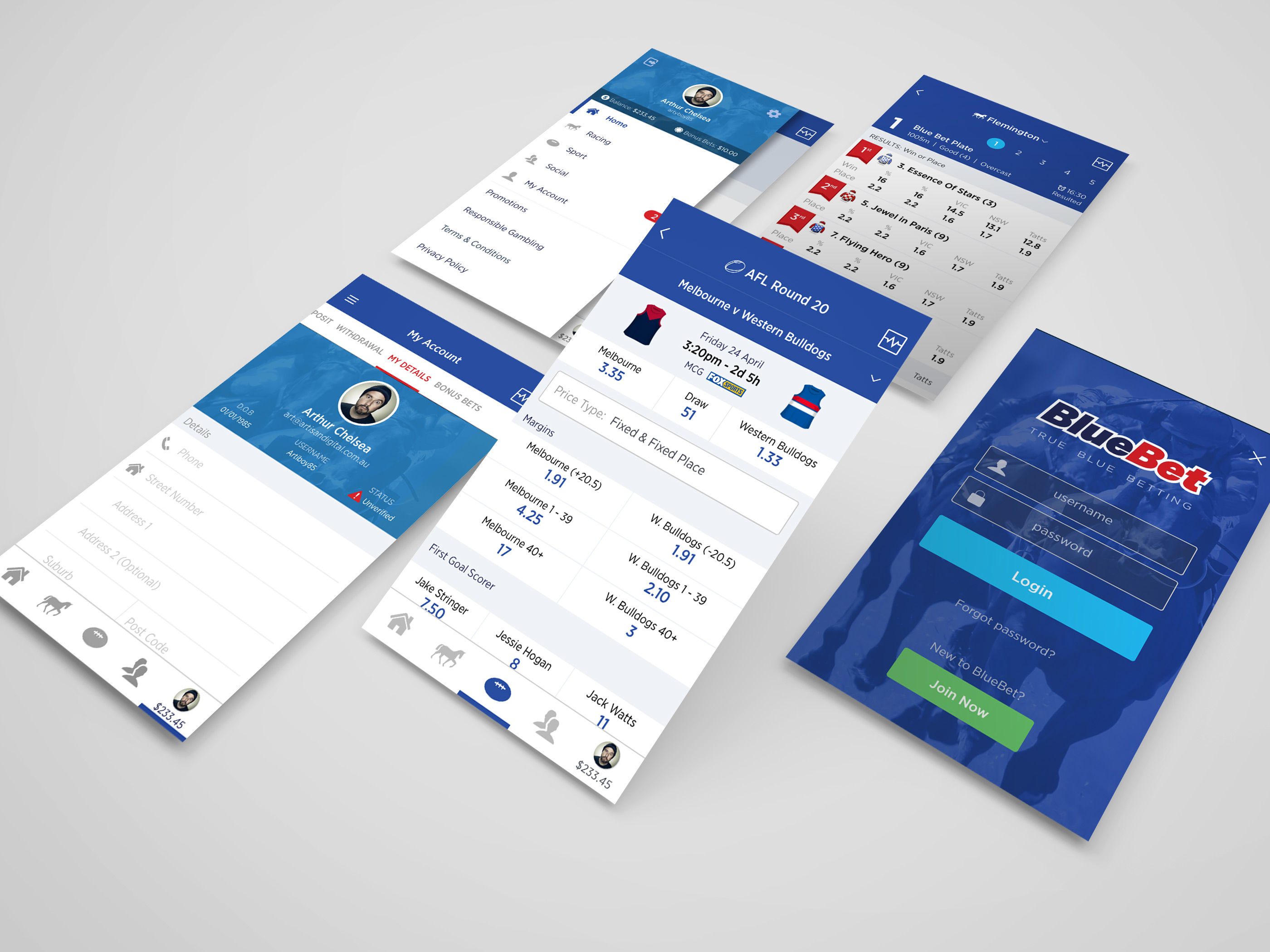
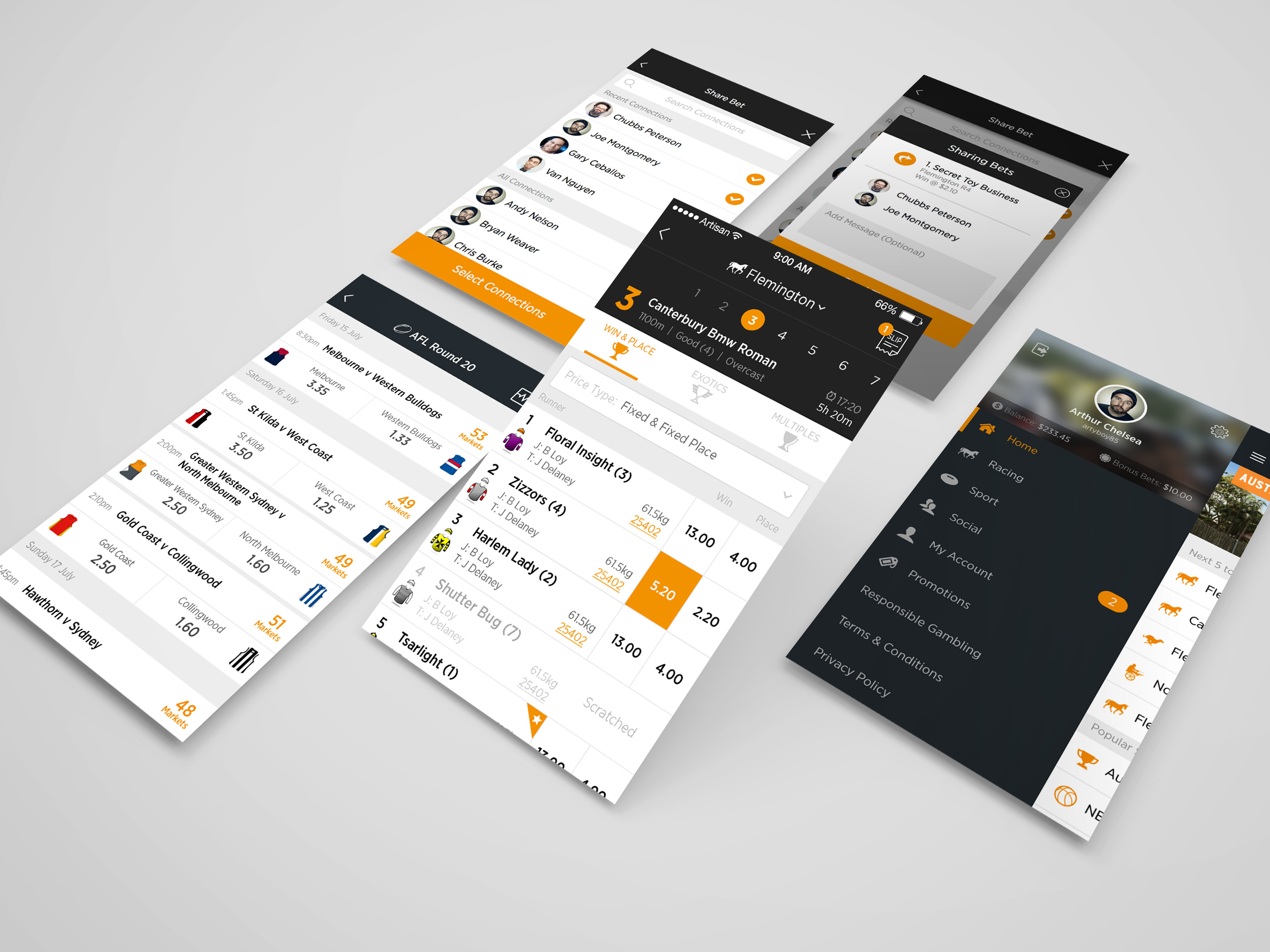
Blue Bet
BlueBet are a new racing and sports bookmaker started by the old CEO of Sportingbet. I customized the design of this app based upon structure from previous white label product I designed for our agency. IOS & Android apps and Desktop site available.
Client:
BlueBet
Date:
2016
Service:
App Design
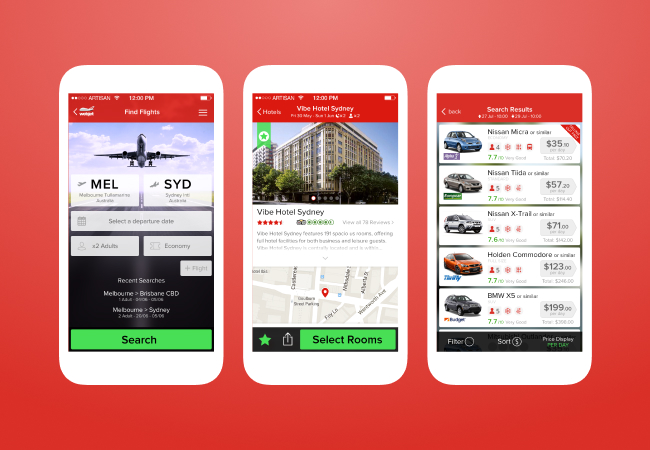
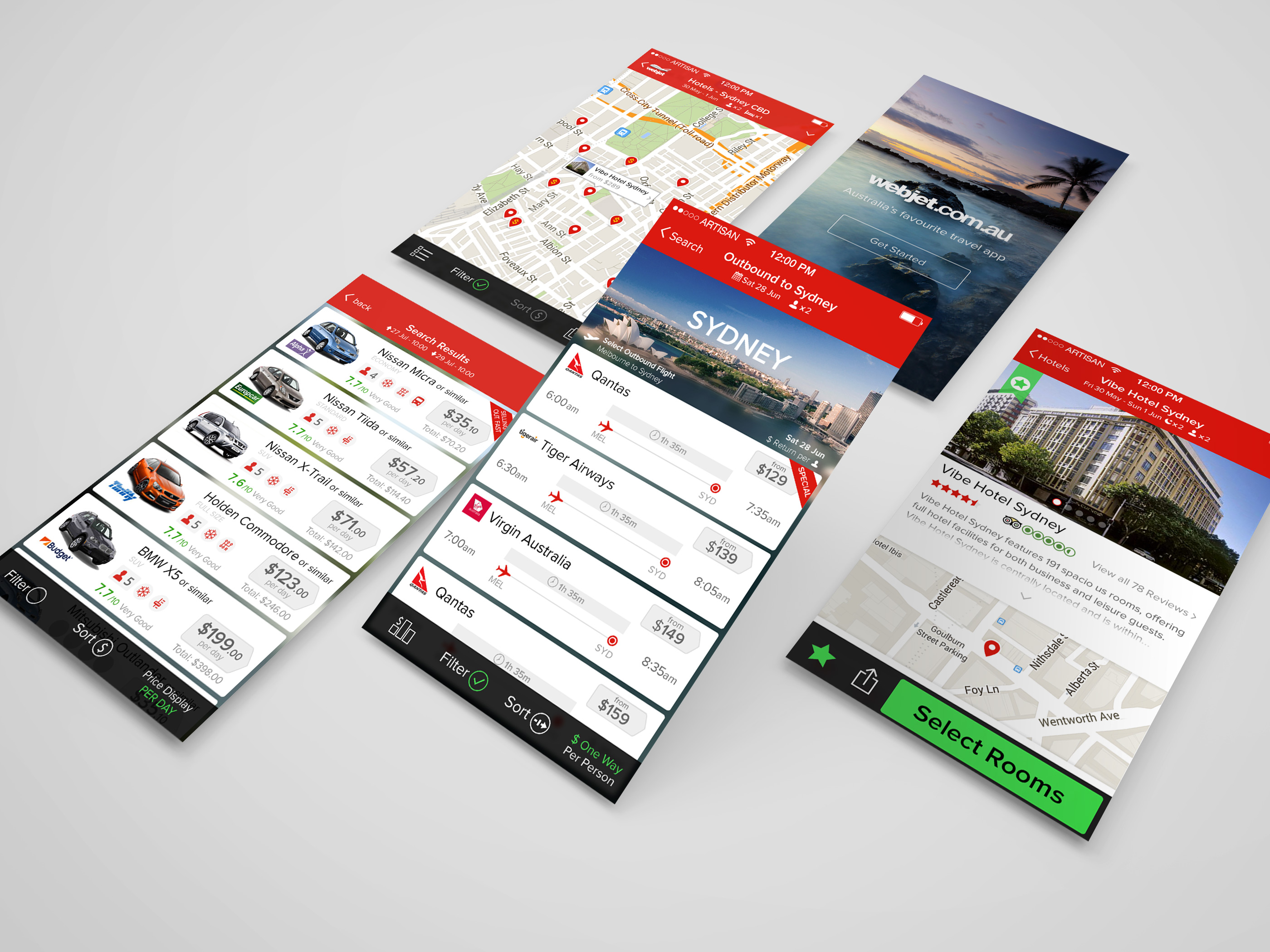
Webjet
Webjet are a leading Flight & Travel comparison site in Australia. In 2014 our agency pitched for the project of IOS & Android apps which I created demo designs for and subsequently won the job. I was lead app designer for this project. I've worked closely with Webjet on a ongoing basis since completion as newer features and UX revisions constantly being updated
Client:
Webjet
Date:
2014 - 2016
Service:
App Design
Betting Club
Betting Club became the first 'Social Bookmaker' in Australia, using a platform created by our agency. I designed the IOS & Android apps, working alongside the desktop developers to give a consistant experience across platforms. Much of this has been kept for white label products. IOS & Android apps and Desktop site available.
Client:
Betting Club
Date:
2015
Service:
App Design
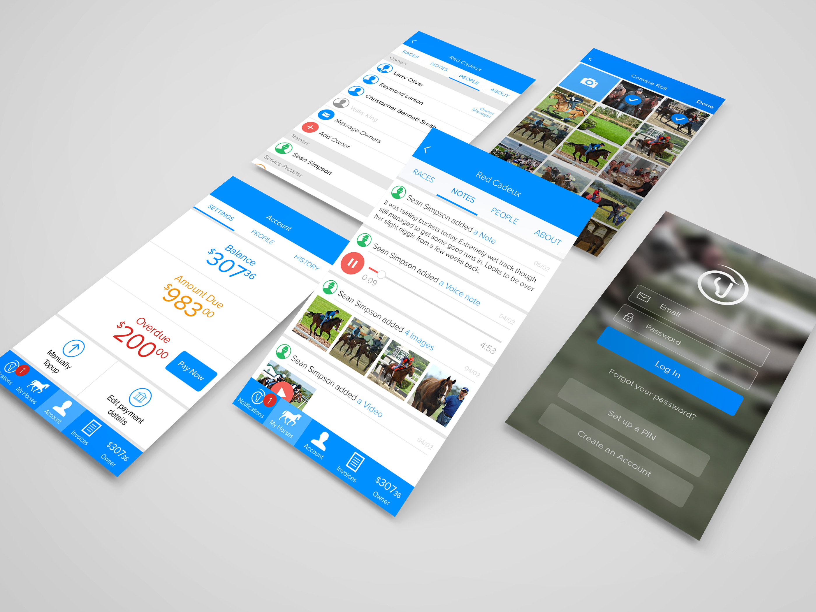
EQ Pay
EQ Pay were are start up company who looked to create digital invoicing between horse trainers and clients. We used a mobile first approach, I was lead app designer taking low fidelity prototypes workflows through to high fidelity.
Client:
EQ Pay
Date:
2015
Service:
App Design
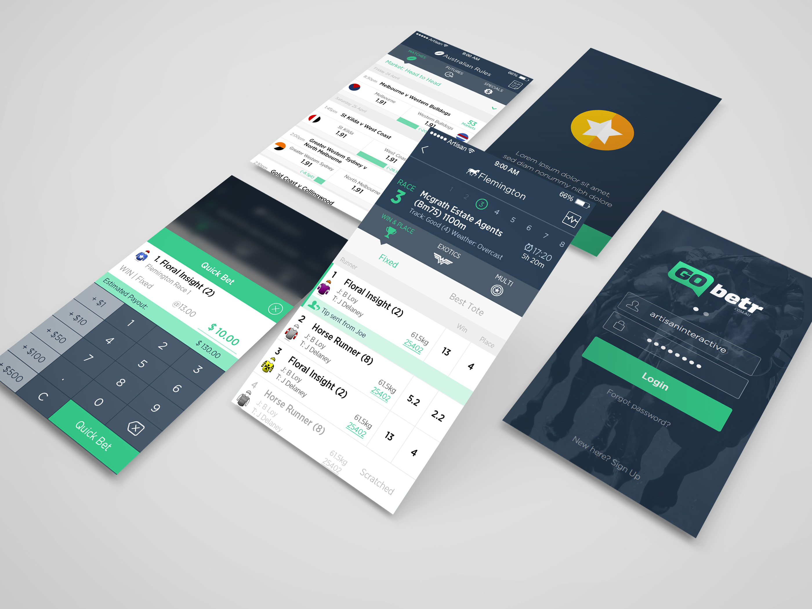
Go Betr (DEMO)
Go Betr were a start-up/demo-ing tool for a custom social betting engine created by our agency. This was essentially a amalgamation of brainstormed ideas and features used as a testing ground and showcase to prospective buyers. My app designs and rapid prototyping were used as a way to test ideas and push the general UI of the product. Betting Club and Bluebet projects were landed, and the betting engine license sold to a large party from UK largely due to this initial project.
Client:
Go Betr
Date:
2014
Service:
App Design
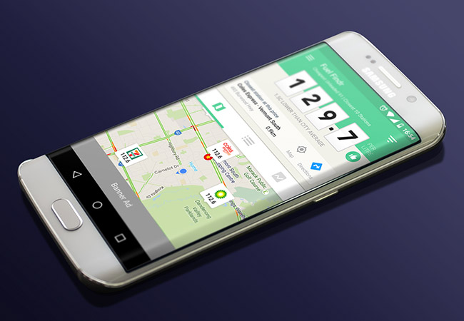
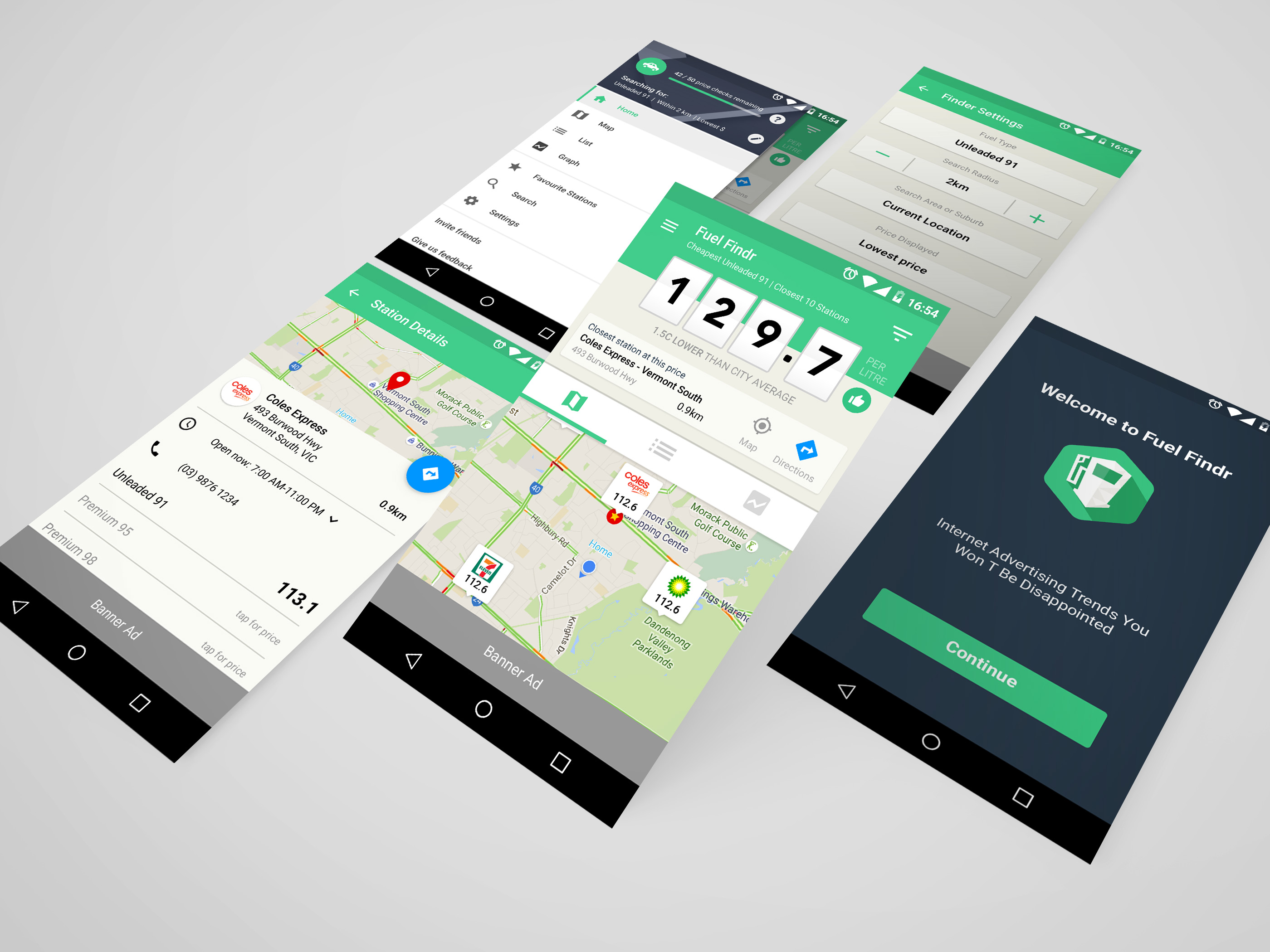
Fuel Findr
Fuel Findr was a personal project I took on partnering with a developer. As this was an Android only project, I strictly followed Google's material design guidelines. We actually have a working draft version in a dev environment. But due to unforseen high licensing costs for fuel data, we've put this project on ice for now!
Client:
Private Project
Date:
2017
Service:
Branding, Android App UI/UX
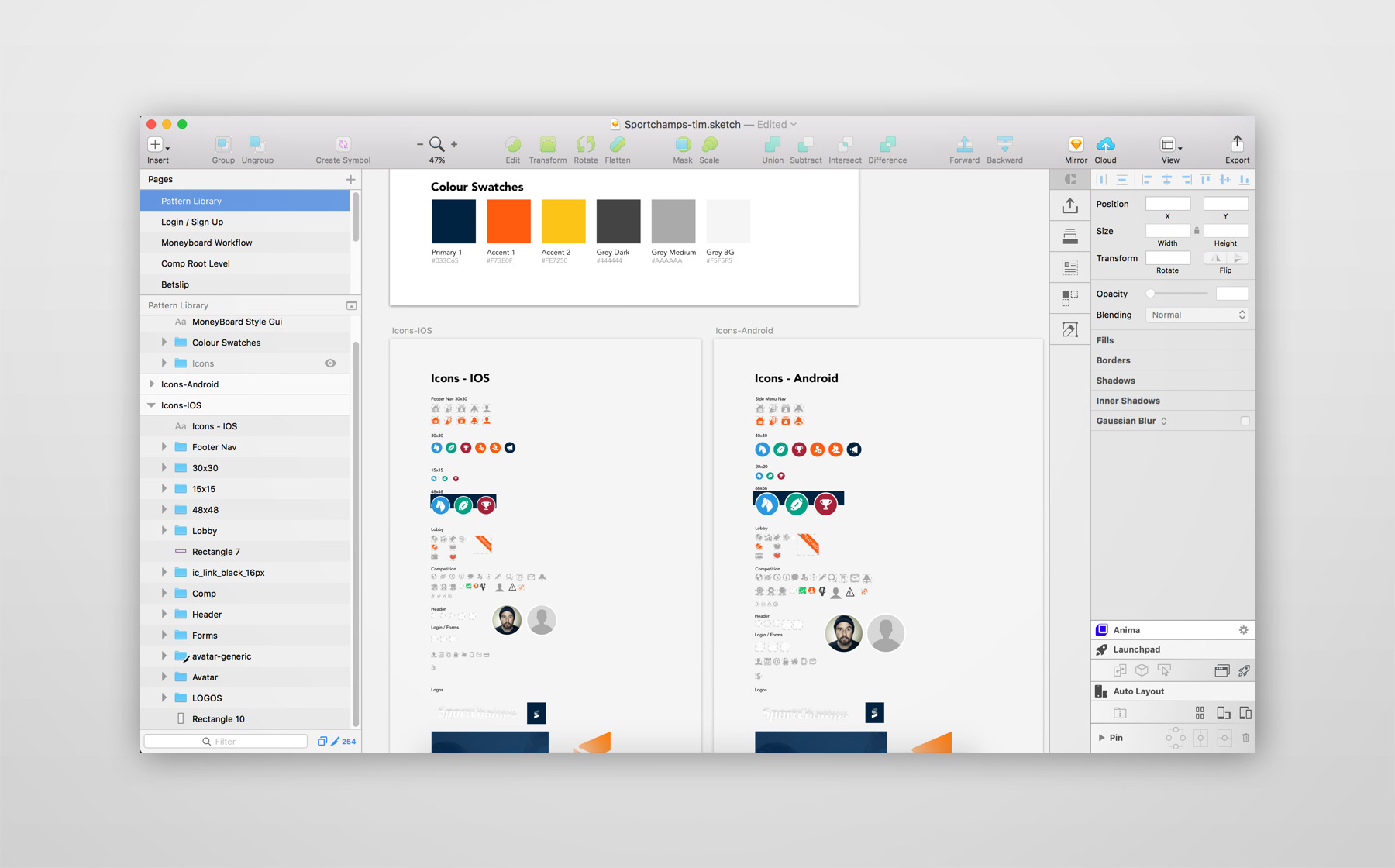
Pattern Library & Dev Handover
My Process of handing over assets to devs is ever evolving as industry standards move forward and as I strive to get better. My current process is using the sketch plugin 'Zeplin', whereby every mocked screen can be viewed by devs illustrating all padding, margins, colours, font type/weight/style etc. I also group all app icons and images in a centralized icon location using symbols, so any update or change to an icon will change across the entire app. The devs can also use this location as a source to download/export all latest icons in respective sizes (@2x, @3x, hdpi, xdpi etc) for IOS & Android.
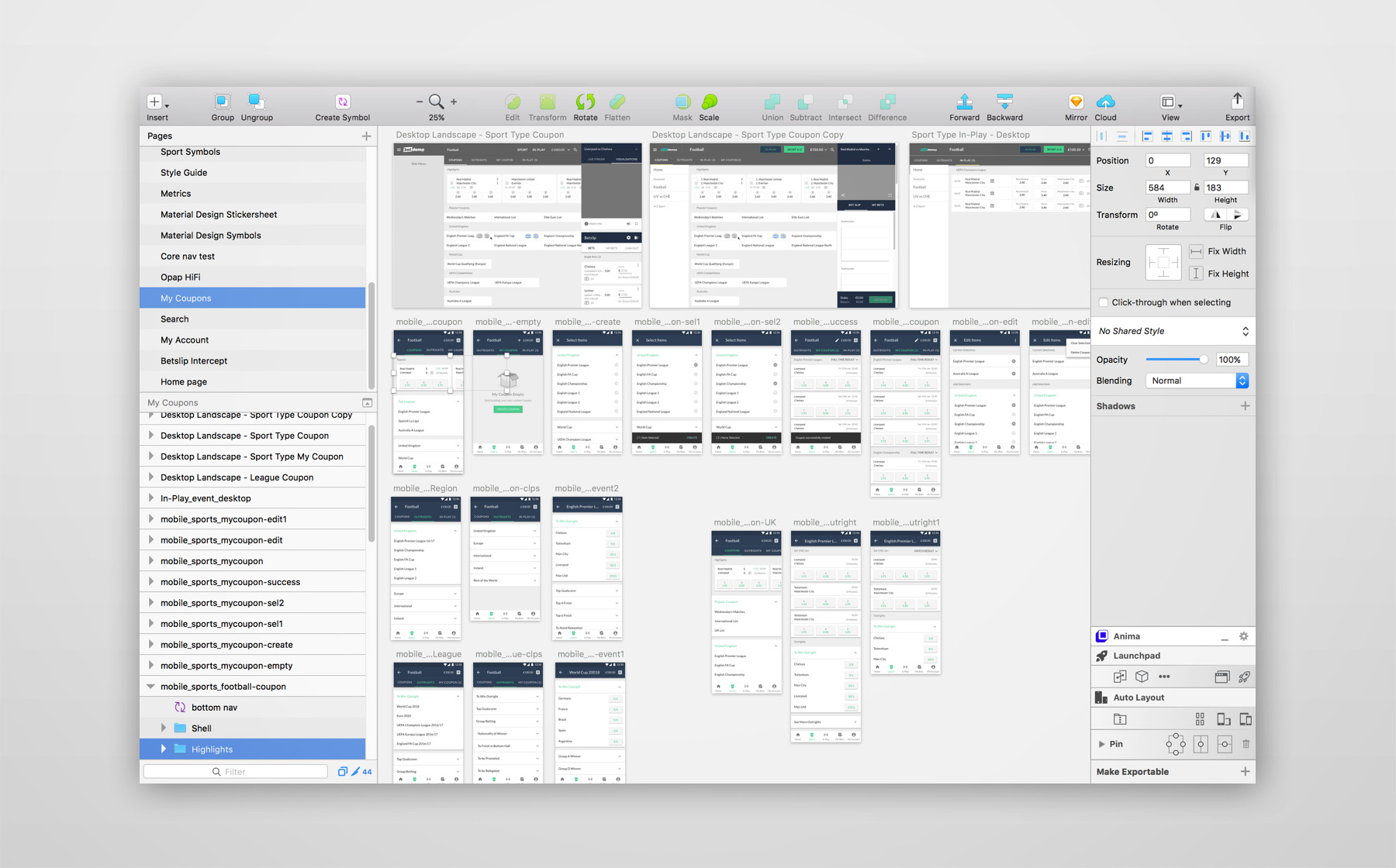
Wireframing / Rapid Prototyping
Wireframing has become an integral part of my design process for the last few years. Using wireframed mocks along with Invision to create rapid prototypes, has helped immensely with refining UX user flows, and adjusting according to internal and client feedback. Using Sketch Symbols and Invision Sync streamlines my process of updating components or moving to High-fi, app-wide.